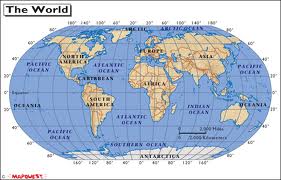
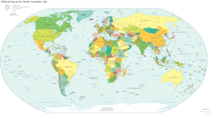
 In 1569, Gerardus Mercator developed a world map that is still in use today. My earliest recollection of a world map is a Mercator projection, and it still is the first thing that pops into mind now. It is the map that makes the most sense to one looking at a map, simply because of the way we are used to viewing photographs and drawings in a flat, two dimensional manner. Projecting the entire surface of a sphere onto a flat surface is not without its limitations, though. That there are people out there who have only recently become aware of this through the distortions of social media is a testimony of the failure of our educational system to teach real geography. We have more than one generation who do not understand maps, and those are the same folks we hear about who are likely those who cannot find North America on a globe. This is shameful.
Naturally, a globe is a much better representation of the earth than a flat map. If this needs further explanation, then you are likely counted among those who cannot find North America. I regret that. You should, too.
Since we use latitude and longitude for navigation, and the latitude lines run east/west and are parallel, even called parallels, these lines never 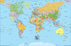 intersect. If one needs further explanation of the nature of the non-intersection of parallel lines, then we might point to another indictment of our educational system. I will regret that, too.
The lines of longitude, or meridians, run north/south, intersecting at the poles. Zero degrees longitude is known as the prime meridian, which runs from the North pole, through Greenwich, England, thence to the South pole. A benchmark had to be established at some point, and it so happened that Greenwich was the place. It could have been anywhere.
The North Pole is at 90° North Latitude. At exact 90°N, the only direction one can travel is South, though at one foot South of true 90°N you can travel from east to west very quickly. The further South one goes, the longer a circumnavigation of the globe takes. If you get to 0° Latitude, you are at the Equator, which, as on any sphere, offers the longest distance around it, though a sphere is not particularly concerned about any particular cross section that passes through its center, as they are infinte in number and all the s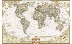 ame size.
Due to the rotation of our Earth, it is not a perfect sphere. It bulges slightly at the Equator, and is about .0033528 times larger there than at the poles. If a true scale model globe were created which measured exactly one meter in diameter from the North pole to the South pole, it would measure 1.0033528 meters across at the equator, a distance of 3.35 millimeters more, which is measurable, but hardly noticeable to the naked eye.
The Earth’s circumference at the poles is 40,007.86Km. At the equator, it is 40,075.02Km. That is a difference of 67.16 Km, or about 41 miles, or about the distance east-west across the Dallas/Fort Worth metroplex, or a two day hike, or a 40 minute car ride depending on the traffic…well, you’d have to travel through DFW at midnight on a holiday, but I’ve done it.
 Mercator’s only agenda in the production of his map was to make the most accurate one he could as an aid to navigation. It seemed reasonable to put the equator in the middle. He was very well aware that when you make a map that has the lines of meridians parallel, there is a significant amount of distortion, ranging from none at the equator to nearly infinite at the poles, since at the poles, the normally intersecting meridian lines are shown parallel, in a grid. Though this distortion exists, it is still a useful map, though more useful for navigation than as a projection of the globe for political purposes. In the last 500 years, many different types of maps have been developed to deal with the distortions of Mercator’s projection. Some of them do a remarkably good job of minimizing, but not eliminating, the distortions, but to most people the most accurate ones look nothing much like the maps they are accustomed to seeing.
 In Mercator’s projection, the Island of Greenland looks about as large as the continent of Australia, and Africa, seated pretty much astride the equator and shown with hardly any distortion, seems much smaller because of the polar distortion, even smaller than Antarctica, which, seated astride the South Pole, looks much like the ancient Pangaea.
Remarkably, I learned about the Mercator map and its distortions in junior high school geography. One only has to look at the map and then a globe to see for one’s self that the distortions exist, and easily see the reasons why. This is not a secret. It is not a conspiracy. It is not a political plot hatched by Euro-centrists to make Africa seem to be less than it is. It is merely a cylindrical projection onto a flat surface of the surface of a sphere.
The purpose of this is to illustrate some utter foolishness I recently came across. I have read many links to UPWORTHY which people have sent me or posted on social media. Many of these links to UPWORTHY articles have been inspiring and enlightening, but this one missed the mark by a mile:
http://www.upworthy.com/we-have-been-mislead-by-an-erroneous-map-of-the-world-for-500-years?rc=ab2
If 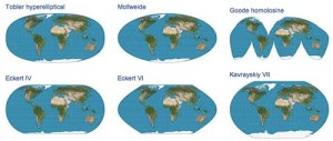 one has been mislead by the distortions of a Mercator map, then their schools failed them, or their own curiosity and thirst for knowledge failed them, or, perhaps, they are just dullards among whom the dullest are those who think that a plot was hatched by Mercator and perpetuated into modernity by those who purposefully wish to deny that Africa is the size that it is. It does not detract from Africa the least little bit that Greenland and Antarctica are shown to have apparently larger land masses than they actually do. Few Africans are interested in those land masses, nor many Europeans, as they are both rather inhospitable places.
 Why would the writer of the UPWORTHY article imply that I have been intentionally mislead and lied to as part of a political conspiracy when every 8th grader should know about a Mercator map? I suppose the number of 8th graders these days who know about Mercator and other maps are the same ones who can immediately put their finger on any continent or ocean on a globe. It is unlikely that someone can do one without doing the other. Unfortunately, a National Geographic study found that 47% of the people polled could not find India on a map of Asia. How much better do you think they would have found it on an unmarked globe? Additionally, when southerners in this country were viewing a map and asked about hurricane evacuation, half, HALF!!!, would have gone the wrong way.
This is not a Euro-centrist conspiracy, but ignorance on the part of the conspiracy theorists. With the ubiquity of smart phones around the world, not to mention classrooms, there is not a single reason why our students don’t know more geography. I do. Perhaps it is because I am still a student. And to the person who wrote the unworthy UPWORTHY article….show me a blank map of Africa, and I can point out Malawi, Rwanda, Djibouti, Gambia, Benin, Burundi, Central African Republic, and Botswana, and get it right every time. I can point out Dakar from Dar es Salaam. I can point straight to Kinshasa, Timbuktu, Bamako, and Monrovia. I hope you can, too. I hope everyone can.
 I made a comment about the alleged intentional map-prone deception, saying that a globe was a better representation of the earth than a Mercator Map, and was rebuffed, someone citing the fact that because the Earth was not a true sphere, Africa was still under-represented due to earth’s bulging equator. The UPWORTHY article made no mention of South America’ s equRorial under-representation, of Oceania, nor, of course, Antarctica, because, after all, who cares anything about Antarctica other then Emperor Penguins and Weddell seals. One can also purchase a globe that is geographically correct, much like one can purchase anatomically correct dolls these days. Remarkably, a physical relief globe that is correct in scale is as smooth as a billiard ball, and just about as round.
I am usually tolerant of things that don’t matter, but knowledge of our earth and the physical and political world around us do matter. What does not matter is the UPWORTHY article which was about as useful as a warning sign that reads, “Don’t Forget to Breathe.”
 UPWORTHY missed it this time. Mercator and his minions are long dead and Africa is still the same size it always was…so is Greenland, one of the world’s first recorded real estate scams, the ancient equivalent of selling the Brooklyn Bridge, which, by the way, if you believe in a worldwide-Geo-political conspiracy based on the distortions of a Mercator map, then, maybe, you’d be interested in a bridge….
If the world needs UPWORTHY to tell us about something every 8th grader should know, then…well….that’ll just have to speak for itself….and maybe UPWORTHY will continue to be worthy of further reading. I’m not ready to write it off because of one, blown, over-the-top political faux pas, but they sure need a drubbing this time, or…if you learned something about maps from the UPWORTHY article, perhaps it’s you who need the drubbing, though what you now know about maps is perhaps far more than you now know about Geo-politics.
More maps! Less foolishness! Please!
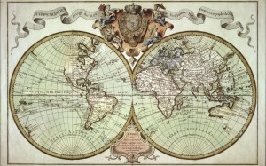
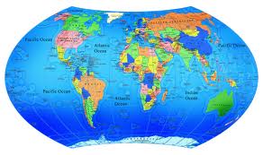
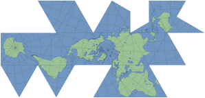
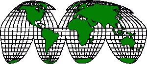
NOTE: Other than the Mercator map, each map photo is a variation of someone’s effort on how to correct the errors of world map projections. The one that is most correct, Buckminster Fuller’s Dymaxion Map is the one that least looks like a map.Do you know the Mercator Map from the others?
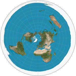 Update 2/7/14….A friend who splendidly represents the art of grouchy curmudgeonry brought to my attention that I might have included a polar projection map, which is extremely useful for aviators, as a straight line drawn between any two points shows the shortest global flight path, even though the map itself gets increasingly distorted as one veers from the North pole. North is the center, and south is the outer circumference of the circle. Demographics, not politics, limit the usefulness of a southern polar projection map, though they are available if you want to see one.
